

CATEGORIES:
launch lab | online business | websites | strategy | branding
The most important page on your website.
Let’s breakdown a page that most of us know is important, but still doesn’t get a lot of love: the product page!
Whether you’re building your own Shopify site or working with a designer, it’s easy to make your homepage the priority. And no doubt, your homepage is extremely important. If someone lands on it for the first time and gets confused, they’re gone.
Your homepage’s job is to introduce your brand and entice visitors to explore products. It’s a jumping off point to the rest of your website.
And the end goal of your website? To sell your products. And that’s your product page’s job.

Your product page does a lot of heavy lifting, yet I often see it almost completely bare. A photo or two and a one-sentence description isn’t going to cut it. Yes, you may have a huge, engaged audience ready to buy literally anything from you (lucky duck!) but if you want to sell to a new audience, it’s imperative to actually sell your product.
So how do you do that?
Here’s the structure I recommend for your product page, in order from top to bottom:
- Breadcrumb Navigation
- Product Title
- Product Description
- Product Photos
- Product Form
- Reviews
- Related Products
Let’s dive into detail, shall we?
First, an example so we can see what we’re talking about:
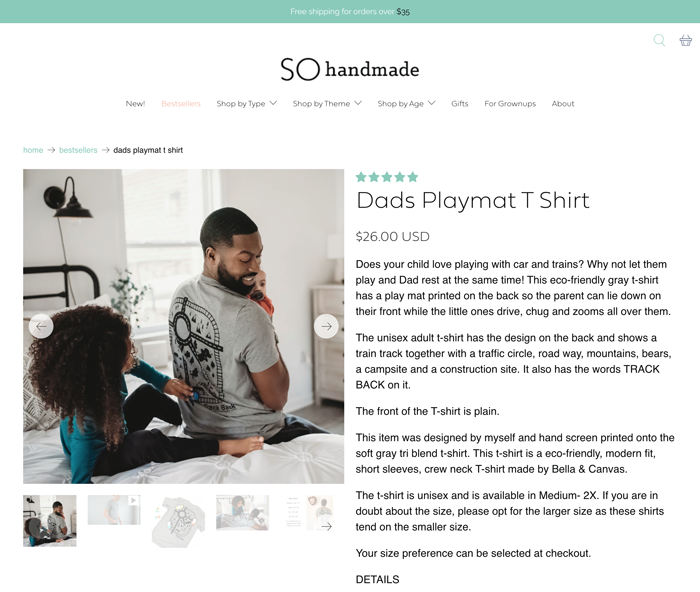
This is my client SO Handmade (love you Sarah!)
Above her product photos on the left is the Breadcrumb Navigation. You want to enable breadcrumbs on your Shopify theme for two reasons: Most importantly is usability. Make it as easy as possible for someone to click through to see more products in the category they’re interested in. This makes your site more browsable and shoppable. Secondly, is SEO. Depending on how you name your collections, this can be another way of telling Google, “here’s a keyword that’s important to this website.”
Next, onto your Product Title and Description. I know many of you are on Etsy where product titles play a big factor in how you’re found through Etsy search. That’s not the case on Shopify. You want to keep your product tiles simple and brand relevant.
For your product descriptions, I follow my friend Anna Bradshaw’s (of Anna Bradshaw Copywriting) guidelines. Start with a chunk of text followed by some bullets and another chunk of text. This can be expanded for products that need longer descriptions, but it’s a great starting point for most products.
And now, Product Photos! This is such an important part of your product page, possibly the most important. Here’s where you need to do a lot of selling. You want to entice customers to envision owning your product. It’s helpful to have a variety of shots here. Here are some examples:
- Your product on a white or simple background
- Lifestyle shots – your product in use in a setting that makes sense
- Scale shots – your product in a hand or next to something that will give size context
- Multiple angles of your product
- Close up: the texture of your product
- Videos! I don’t see this often but love a very short video of someone interacting with your product in some way
- Reviews! I also don’t see this often, but you can share a review/testimonial graphic in your product carousel
Next, your Product Form.
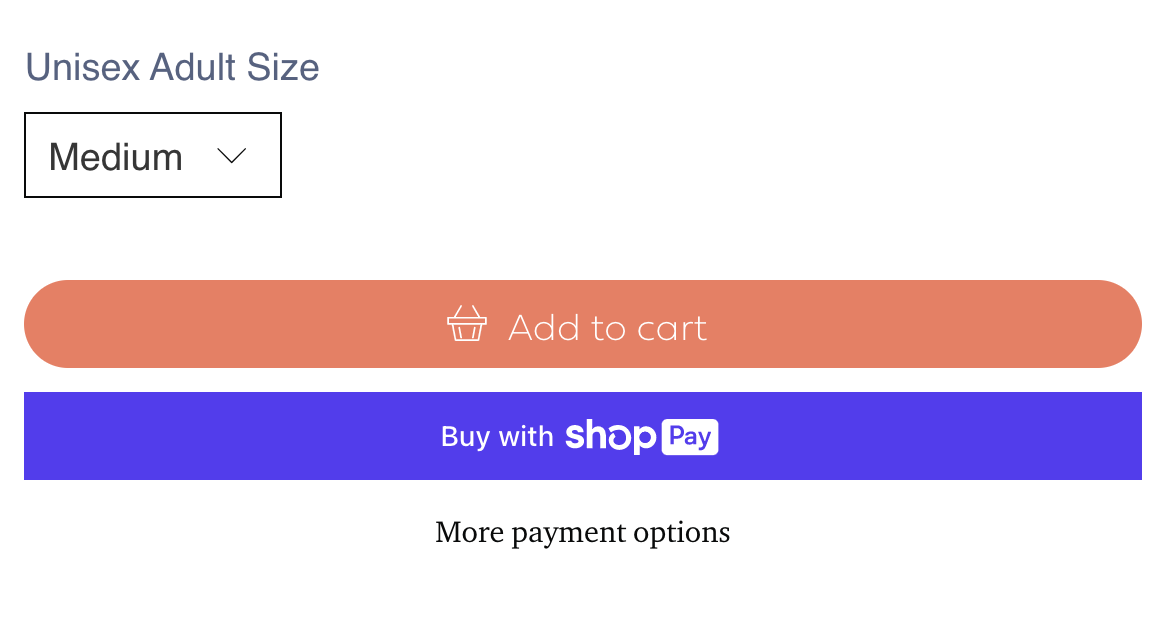
Essentially, this is where your buy buttons are for your product. Your product form can also have variant options, shipping information, remaining stock notifications and more.
We really want people to click “Add to Cart”, so make that button high contrast. If you have dynamic checkout enabled with Shopify those buttons will appear too. They enable customers to skip the cart and go straight to an accelerated checkout with their credit card and shipping info saved.
If someone “Adds to Cart” but doesn’t buy, that will initiate the Abandoned Cart sequence, either from Shopify or your email newsletter provider (I suggest the latter).
All of the above is the top of your product page. Below is where you can do additional reassuring for customers who aren’t quite ready to Add to Cart.
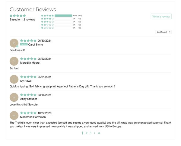
I can’t recommend enabling Reviews on your website enough. They’re such valuable social proof, even if you don’t have loads of them. The Review app I use and love on my client stores is called Judge.Me, and that’s what you’re seeing in this screenshot on SO Handmade. Their free plan is great!
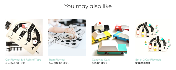
Below Reviews, it’s time to show more products! You can have one or two or even more rows of Related Products. You want to give your visitors lots of potential options for something to catch their eye.
Follow this structure and your product page will be in tip-top shape, setting your store up for conversion success.
Was this breakdown helpful? I’d love to know if you want more of this type of content. 🙂


📣 Calling all Etsy sellers, boutique owners and makers!
If you're tired of dealing with Etsy's fees, algorithm and ODR and want to build your business on a site that you own, keep reading!
Learn all about Shopify from a pro in my FREE workshop, Sell More with Shopify. I'm sharing my design secrets to turn visitors into customers.
